Branding: Prief
Prief is a web-based business providing information to amateur pharmacists. For this company, I designed the logo, website slideshow, tabs, video thumbnails, and detailed pages. The design elements were created to evoke trust and stability, catering to the needs of Prief's audience.
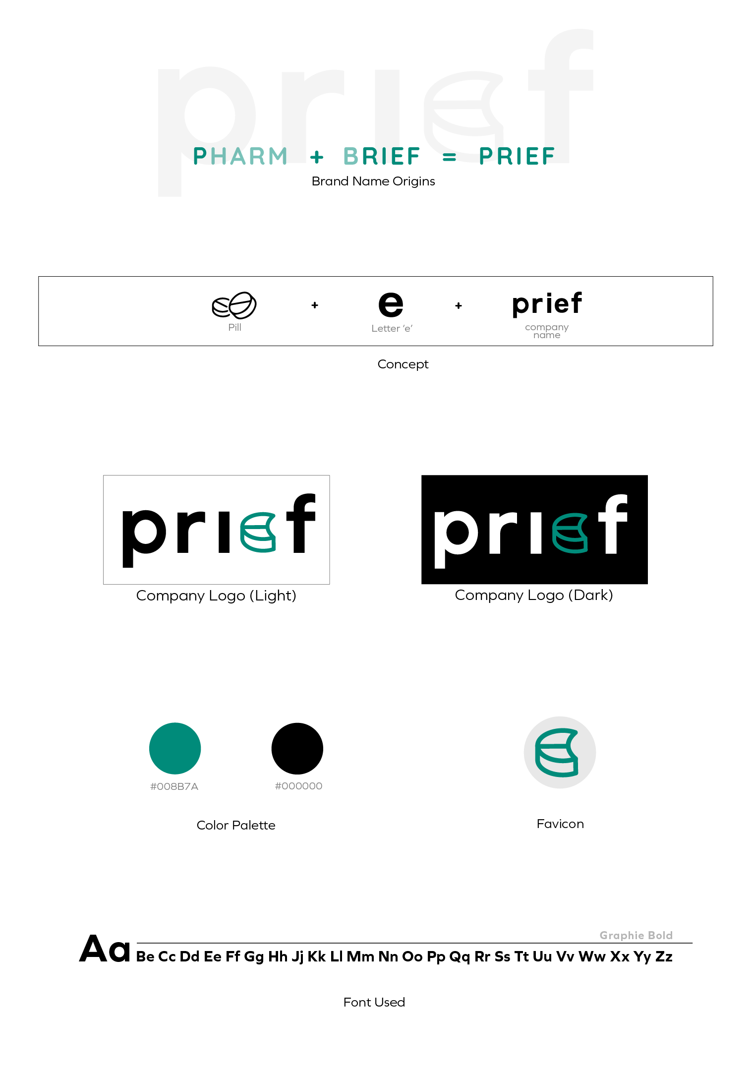
The Prief logo was crafted with a green color scheme to convey trust and stability. I incorporated a pill icon for immediate recognition and used bold, solid fonts to add a sense of seriousness.
Additionally, for Prigora—a discussion application belonging to Prief combining Prief and Agora—I designed a logo that includes elements of the Greek Agora temple. The "g" in Prigora was shaped to resemble a pill and a person speaking, reflecting the interactive nature of the platform.
Tab Design
For Prief's website, I designed tabs that included sections for instructor profiles, course descriptions, monthly pricing, and company policies. These tabs were crafted to be clear and user-friendly, incorporating complementary colors and visual elements such as graphs and illustrations to enhance readability and engagement. The goal was to provide essential information in a concise and visually appealing manner.


